
You know that feeling when you're trying to compare five different things across eight different metrics, and your bar chart looks like a game of Tetris gone wrong? Yeah, we've been there too. That's why we just shipped radar charts in Tractorscope.
What's a Radar Chart Anyway?
Picture a spider web where each spoke represents a different metric. Your data creates a shape on that web—kind of like a fingerprint for your numbers. The bigger the shape in any direction, the better you're doing on that metric. Simple as that.
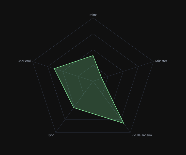 A radar chart comparing product features—way easier to digest than 5 separate bar charts
When They Actually Make Sense
Look, we're not going to pretend radar charts are the answer to everything. But there are a few scenarios where they absolutely crush it:
Comparing products or competitors - See strengths and weaknesses at a glance instead of bouncing between multiple charts.
Skills assessments - Perfect for those annual reviews where you need to evaluate people across multiple competencies. One look and you know exactly where the gaps are.
Performance scorecards - When you're tracking KPIs across different dimensions (quality, speed, cost, satisfaction), the shape tells the whole story instantly.
Anything cyclical - Monthly patterns, hourly trends, seasonal data—if it naturally loops back on itself, a radar chart just makes sense.
The Cool Stuff We Added
We didn't just slap a basic radar chart into Tractorscope and call it a day. Here's what makes ours special:
Multiple Y-axes that actually work - This one's big. Most radar charts force everything onto the same scale. Ours lets you compare revenue (in millions) against customer satisfaction (1-10 scale) without the math gymnastics. Just flip on "Independent Y Scales" and we handle the normalization.
It looks good - Choose between angular polygon style or smooth circular grids. Adjust transparency so overlapping data doesn't turn into a mess. Add points, remove them, whatever feels right.
Smart tooltips - Hover over any point and get properly formatted values, not just raw numbers. Same tooltip system you're used to across all Tractorscope charts.
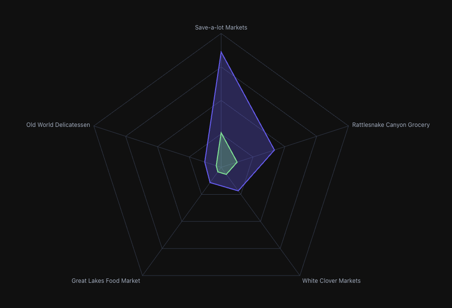 Comparing multiple data series with independent scales—notice how each maintains its own range
Quick Tips for Not Screwing It Up
Don't go crazy with series - More than 3-4 overlapping shapes and it starts looking like abstract art. Keep it focused.
Think about your axis order - Group related metrics together. It actually affects how people interpret the patterns.
Use transparency wisely - When you have multiple series, dial down the opacity so you can see through to the overlapping areas.
Know when to bail - If you need precise value comparisons or you're showing time trends, just use a line or bar chart. Radar charts are about patterns, not precision.
Try It Out
Next time you're in Tractorscope and you've got multi-dimensional data staring back at you, give the radar chart a shot. Just pick it from the chart type dropdown, set your axes, and see what patterns emerge.
Sometimes the right visualization makes all the difference. And sometimes that visualization looks like a spider web.
We think you'll dig it.