
Most "AI in your BI tool" features are a text box that guesses. You type a question, something happens somewhere on a server, and you get back a chart that may or may not have anything to do with the numbers you were looking at.
We know how that sounds coming from the people shipping the AI features, so:

Fair. So here is the through-line, and you can hold us to it: every AI surface in this release is grounded in something specific and checkable — the rows already on your screen, the query already in your editor, or the permissions already on your account. Nothing is asked to guess at what your data might contain.
Ask: chat with the dashboard you're already looking at
There's a new Ask button in the top right of a dashboard. Click it, and a chat panel opens over data the dashboard has already loaded.
That last part is the design. When a chart pulls, its result set is cached and the browser downloads it to render. By the time your dashboard finishes painting, every number on it is sitting in memory. Ask loads a DuckDB engine into that same tab and points it at those result sets.
If you have not run into it, DuckDB is an analytical database that runs in-process rather than as a server — think SQLite, but built for grouping and aggregating rather than for row lookups. The version we use is DuckDB-WASM, compiled to WebAssembly so it executes inside the browser tab at close to native speed. That is the whole trick: a real analytical engine, sitting in the same place your data already is.
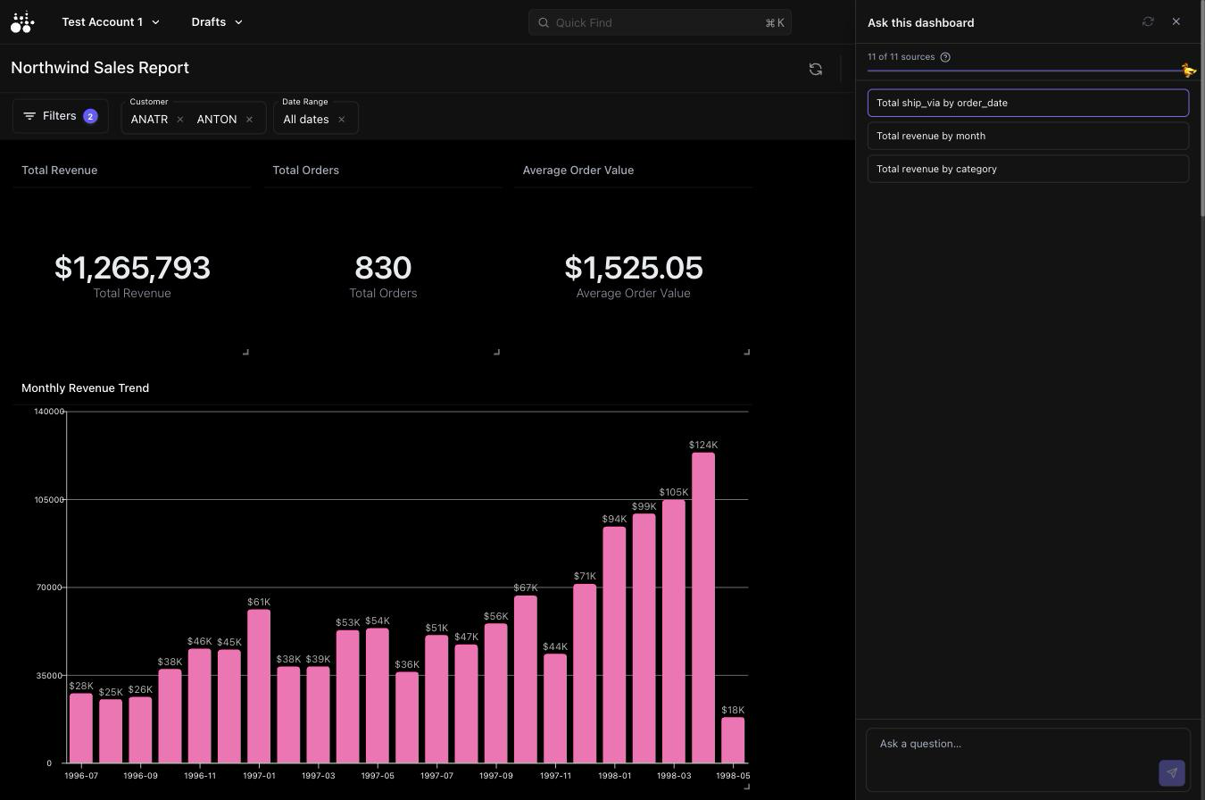
Three things fall out of that, and they're the reason it works the way it does:
- The scope is exact. The data the chat can see is the data on screen — same queries, same active filters. There is no second code path that could quietly reach past what your dashboard shows.
- Your database is never touched. Chat has no connection to your source database. It reads cached, filter-scoped extracts, and nothing else.
- The generated SQL runs in your browser, not on our servers. The model writes DuckDB SQL; that SQL executes in the viewer's own tab, over the viewer's own data. Every statement goes through a guard first that strips literals and comments and rejects writes, ATTACH,INSTALL,COPY ... TO, and theread_*table functions. The engine is also built without network access, so even a statement that slipped the guard has nowhere to go.
Ask questions across charts — "which region drove the Q3 lift?" — and get a number back. Ask for a chart, and it renders inline through the exact same rendering path as every other chart on the dashboard.
The alternative, which we have all done, is opening four charts in four tabs and doing the arithmetic in your head:

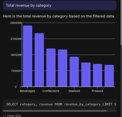
The opening prompts know what's on your dashboard
The starter suggestions used to be a fixed list — "Summarise what this dashboard shows," "Chart the top 10 by value." Those read identically on a finance dashboard and a support queue, and "top 10 by value" is a dead end when nothing is called value.
Now the suggestions are built from the schema actually loaded: real table names, real columns, with identifier columns filtered out so you never get offered a group-by that produces one bucket per row. A suggestion that names a column both works when you click it and teaches you what you're allowed to ask about.
It works in the app, in a share link, and in an embed
All three render through the same dashboard component, so all three get Ask. The headline case is the embed: you drop a dashboard into your own product, and your end users get a self-serve analyst on top of a dataset you already scoped and vetted.
That used to be one switch. It's now three — app, share link, and embed each toggle independently, because turning chat on for your team inside the product is a very different decision from turning it on for everyone holding an embed URL. Existing dashboards kept exactly what they had.
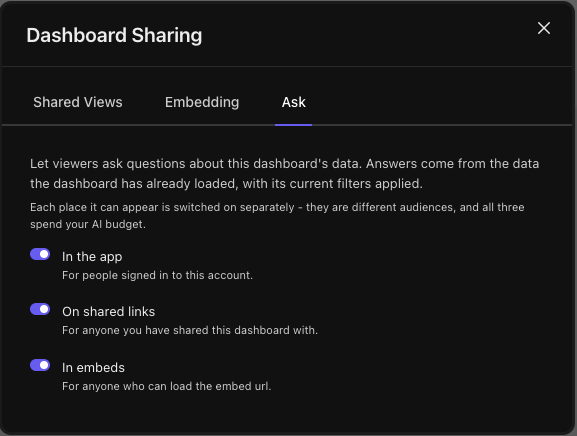
Rate limits are per dashboard and per surface, hourly and daily. An embed URL is a bearer token — there's no viewer identity to key on — so an embed being hammered can't lock the dashboard's owner out of their own chat panel.
Views: a data source that isn't a chart
Charts on a dashboard are usually pre-aggregated. Great for looking at, limited for asking questions of — you can't drill into a total that was summed before it reached the browser.
So there's a new chart type that isn't really a chart: a View. It runs a query and caches its rows like anything else, but it never takes a slot in the grid. It exists to give chat a real, row-level table to work with.
Views appear as pills along the top of the dashboard, next to the Ask button. Click one to see its schema; the menu on each pill opens a data browser over its rows, or removes it from the dashboard. Nothing fetches on mount — a big View would otherwise be dead weight on every embed page load — so the pull is deferred until chat or a person actually needs it.
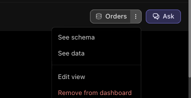
Each View carries a description field, and it's worth writing. It's the one piece of context column names alone can't carry, and it goes straight to the model.
The Interact tab: rebuild a chart by describing it
The chart editor has a new Interact tab, docked in the settings column rather than floating over the canvas.
Ask it for anything about the chart in front of you — "group this by month," "make this a line chart," "why are there duplicate rows?", "explain what this query does" — and it comes back with a narrative plus zero or more proposals.
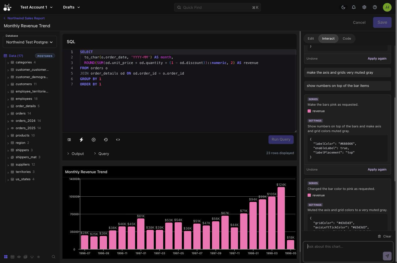
A proposal is a staged change, not an applied one. It can rewrite the query, switch the chart type, change settings, remap which column fills the x / y / y2 / series role, or recolour and re-render an individual series. You review each card, apply the ones you want, revert if you don't like the result, and nothing persists until you hit Save. The endpoint never writes to your chart.
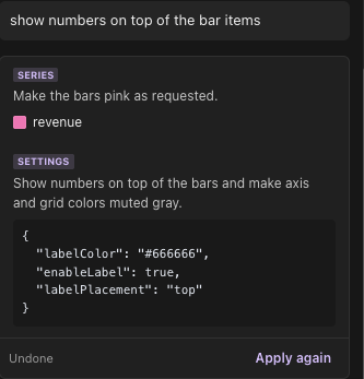
What makes the proposals land is the context the model gets:
- Your working copy, not the saved one. The query, type, settings, series and layers currently in the editor — including edits you haven't saved.
- A censored sample of the chart's own result set. Values are masked; only column names and shapes survive. Enough to pick a sensible axis, not enough to leak a row.
- The same per-type interface files the renderer uses. The vocabulary the model proposes settings in physically cannot drift from what the chart accepts.
- Chart-type guidance. Explicit rules for what a radar's dimensions are, what a pie needs in the series role, what a combo chart's y2 is for. Previously, switching a chart's type left whatever axis the old type had set.
- Date format rules. Format strings are moment.js, matched to the granularity of the data, and normalized on the way back.
When a proposed query fails, a repair prompt sends the error back and tries again rather than handing you a broken chart. Conversation history is kept per chart, so coming back tomorrow picks up where you left off.
The old blank-canvas AI prompt box and the standalone Query Assistant panels are gone — folded into this. A new chart now opens with an inert placeholder that shows the shape of a chart without pretending to be one, and points at the two things that actually produce one.
An MCP server, and you sign into it
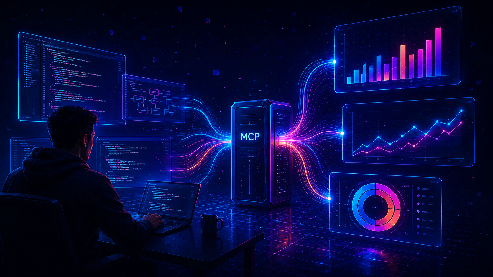
This is the one we're most excited about. TractorScope now runs a remote Model Context Protocol server exposing 30 tools, so Claude Code, Claude Desktop, Codex, Cursor, VS Code, Gemini CLI or opencode can build and maintain your dashboards directly.
MCP is the open standard for how an AI assistant talks to an outside system — one protocol instead of a bespoke integration per client. Implementing it once means every one of those tools gets TractorScope, including the ones that do not exist yet.
| Databases | list_databases get_database_schema query_database |
| Dashboards | list_dashboards get_dashboard create_dashboard update_dashboard clone_dashboard list_dashboard_folders create_dashboard_folder |
| Charts | get_chart create_chart update_chart clone_chart delete_chart pull_chart_data get_chart_data set_chart_fields set_chart_series |
| Filters | list_filters create_filter apply_filters_to_dashboard |
| Alerts | list_alerts create_alert run_alert_check |
| Sharing | list_share_links list_domains create_domain revoke_domain |
| Search | search |
There is no key to copy
Point your client at the server URL and it opens a browser for you to approve. The connection is you — it carries exactly your access, not the account's.
That's not a slogan, it's enforced per tool. Dashboards are shared through groups, and the MCP tools resolve against the same permission model the app uses: a dashboard you can't open in the app can't be read through here, and one you can only view can't be changed. Two things stay account-level because they're account-level in the app too — alerts, which have no dashboard to inherit a grant from, and
You also choose read-only or read-write on the consent screen. On a read-only connection every tool that changes something comes back refused, while listing, reads and search work normally.
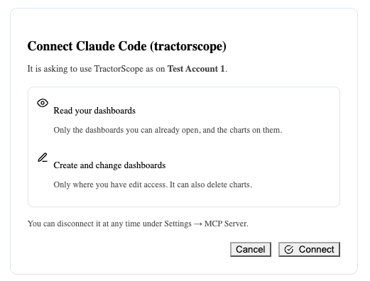
Reads that return rows are recorded — who read what, and how many rows, never the rows themselves.
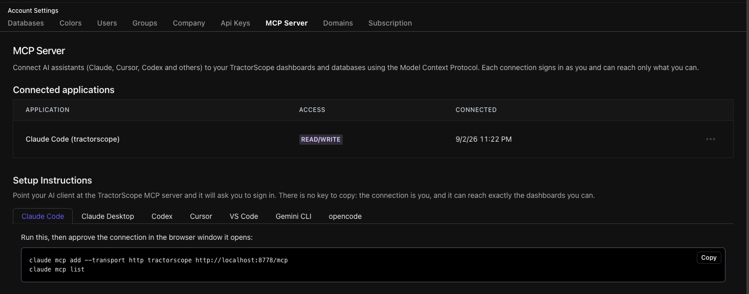
Setup is a copy-paste
Settings → MCP Server has a tab per client with the exact config block, and lists what you have already connected so you can revoke any of it. Claude Code is two lines of
And a skill, so the agent already knows the rules
We also ship a TractorScope agent skill. It documents the sequence that actually produces a working chart — most importantly that
AI you can see, cap, and predict
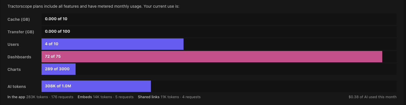
Every AI request on the account is now metered: model, prompt tokens, completion tokens, and cost recorded per request in millionths of a dollar. Fractions of a cent, kept as integers, because anything coarser rounds a real month of usage down to zero.
Every plan now includes a monthly AI token allowance, and it is not an add-on — there is no AI tier, no per-seat AI upgrade, and nothing to enable. It scales with the plan you are already on:
| Plan | AI tokens / month | Roughly |
|---|---|---|
| Solo | 500K | ~100 questions |
| Lite | 5M | ~1,000 questions |
| Plus | 15M | ~3,000 questions |
| Team | 40M | ~8,000 questions |
| Business | 100M | ~20,000 questions |
A token is about a word and a half, counting both the question and the answer. One dashboard chat turn, or one suggestion in the chart editor, averages around 5,000 of them — that is what the right-hand column is doing. Autocomplete in the SQL editor is far cheaper; a chart rebuilt over a long back-and-forth is dearer.
Reaching the allowance stops AI for the rest of the month, and everything else carries on as normal — dashboards, charts, embeds and scheduled reports are untouched. We never bill you for AI beyond what your plan includes. No overage, no surprise line item, nothing to opt out of. Your allowance resets on the 1st, and a larger plan raises it.
Settings shows where the month went: the meter against your allowance, a split by surface — the app, shared links, embeds — and what it has cost so far, with the months before it underneath.
We went back and forth on metered overage and landed here instead, because we have all had the month where a usage-based tool quietly kept going:

Accounts can also carry their own token limit that overrides the plan's, so a support bump or a negotiated deal doesn't mean editing a Stripe product everyone else shares.
There's a bill estimator on the pricing page now too, so you can work out what a plan costs you before you're on it.
Smaller things that add up
Charts name themselves. A chart or View born as "Untitled Chart" gets a real name generated from its query after you save. It only ever overwrites the untitled default — type a title while it's in flight and yours wins.
Database errors stop leaking row data. Driver errors quote values out of your result set: MySQL's

They're now scrubbed before any of that. Queries and column names are deliberately kept — they're what makes a broken chart fixable, and they reveal nothing your own SQL didn't already hold.
Emailed reports can be secure links. Instead of attaching the image, send a link that expires, stops working when you remove the recipient, and records every view in the audit log. Recipients still don't need a TractorScope account, and the image never passes through our servers — the link redirects to a short-lived presigned URL in your own bucket.
Charts and alerts load with proper placeholders instead of popping in.
Chart editor fixes. Layer configurations deduplicate rather than piling up. A series name containing a comma no longer splits into the wrong series and vanishes from a bar chart. Filter validation stops rejecting valid
Where to start
If you have one dashboard you'd hand to a customer, turn on Ask for its embed and add a View underneath it. That's the fastest way to feel what changed — a dashboard that answers questions instead of just displaying answers.
If you live in an editor, connect the MCP server and ask your agent to build you something. Two minutes of setup, and the thing that used to be an afternoon of clicking becomes a sentence.
And as always — tell us what breaks and what you wish it did. That's most of how this list got written.
Stay data-driven, friends. 📈