In the realm of data, a picture is worth a thousand rows. Data visualization, the art of translating raw numbers into graphical forms, has the power to illuminate patterns, reveal insights, and tell stories that change our understanding of the world. Let’s embark on a journey through time and space to explore ten famous data visualizations that have not only transformed data into art but have also left an indelible impact on human history. Perhaps they can be some inspiration to the data projects that you are working on.
-
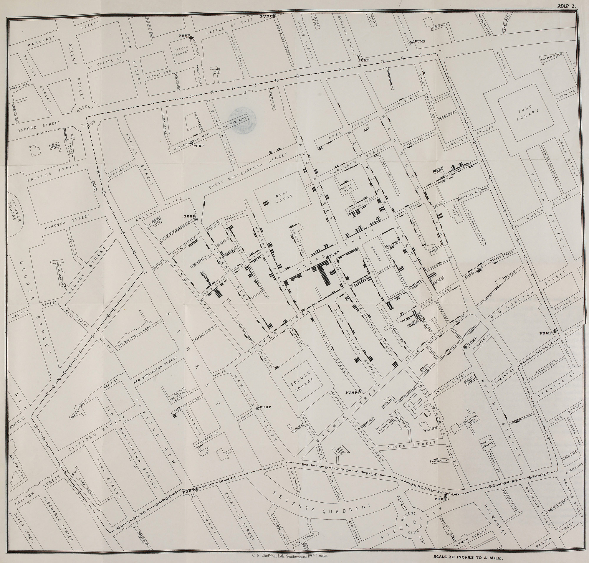
The Fight Against Cholera: John Snow’s Map (1854)
Our journey begins in the heart of Victorian London, where Dr. John Snow plotted a cholera outbreak onto a map of Soho. His simple yet powerful visualization, showing a concentration of cases around the Broad Street water pump, debunked the prevailing miasma theory of disease and laid the foundations of modern epidemiology.
-
The Tragedy of War: Charles Minard’s Map of Napoleon’s Russian Campaign (1869)
We step into the chilling winter of 1812. Charles Minard captures the disastrous fate of Napoleon’s army in a striking flow map that combines six data types, including the army’s size, distance traveled, temperature, and latitude and longitude. The dwindling beige and black lines, which signify the army’s decreasing size, silently narrate a tale of hubris and disaster.

-
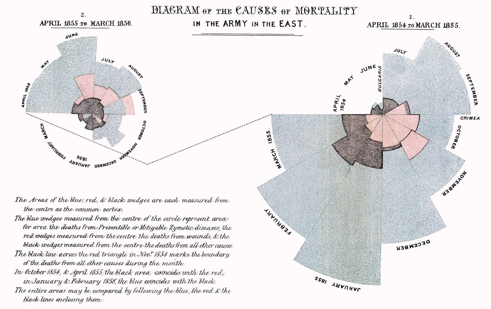
The Lady with the Lamp: Florence Nightingale’s Rose Diagram (1858)
Florence Nightingale, known for her nursing prowess, was also a pioneering statistician. Her ‘Rose Diagram’ was a powerful visual weapon in her campaign to improve sanitary conditions in military hospitals, revealing that more soldiers died from disease than battle wounds during the Crimean War.
-
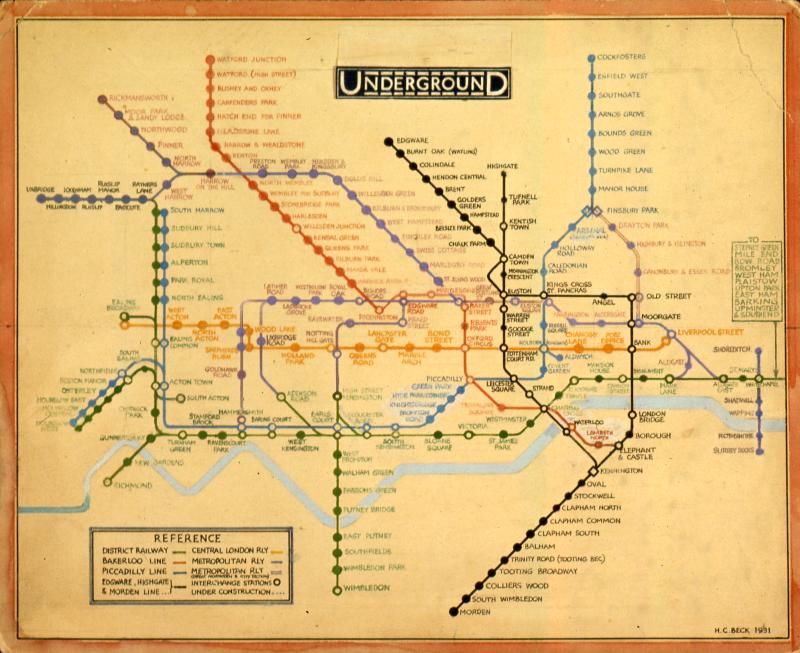
A Guide through the Underground: Harry Beck’s London Tube Map (1933)
Beck’s iconic London Tube Map transformed the labyrinthine network of London’s underground into a simple, easy-to-navigate diagram. Despite its geographical inaccuracies, the map’s clean lines and color-coded routes revolutionized how passengers navigated the city.
-
A Global Perspective: Gapminder’s Bubble Chart (2006)
As we leap into the digital age, Hans Rosling’s dynamic bubble charts come to life, encapsulating centuries of global health and wealth trends into a few minutes of captivating animation. His presentations, bursting with colorful bubbles, debunked common misconceptions about ‘developing’ countries and highlighted humanity's progress.
-
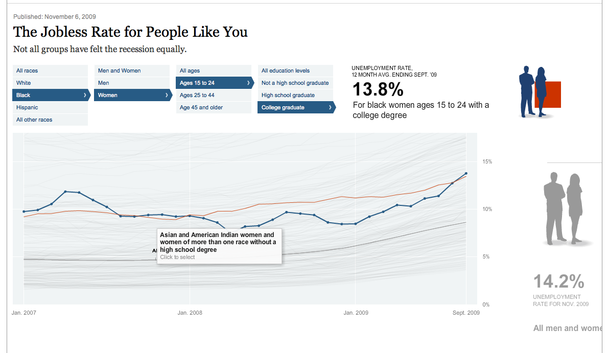
Recession in Focus: The New York Times’ “The Jobless Rate for People Like You” (2009)
The New York Times created an interactive chart that personalized the crisis in the wake of the Great Recession. By filtering unemployment rates by age, race, education, and sex, readers could see how the economic downturn affected demographics like their own, driving home the reality of the crisis.
-
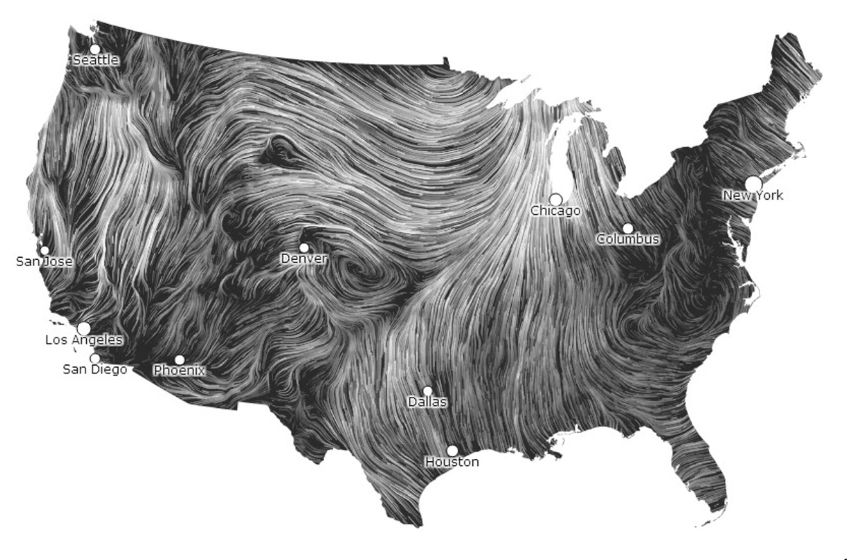
The Breath of the Earth: Wind Map by Fernanda Viégas and Martin Wattenberg (2012)
This mesmerizing real-time visualization of wind flowing over the U.S. beautifully demonstrates the potential of data visualization for environmental data. The shifting patterns of white lines form a living portrait of the planet’s breath.
-
A Connected World: Facebook’s “A Map of Connectedness” (2010)
In the realm of social media, an intern at Facebook visualized the global fabric of friendship. The dazzling array of lines, each representing a connection between friends, painted a picture of a world that is increasingly interconnected, regardless of physical borders.
-
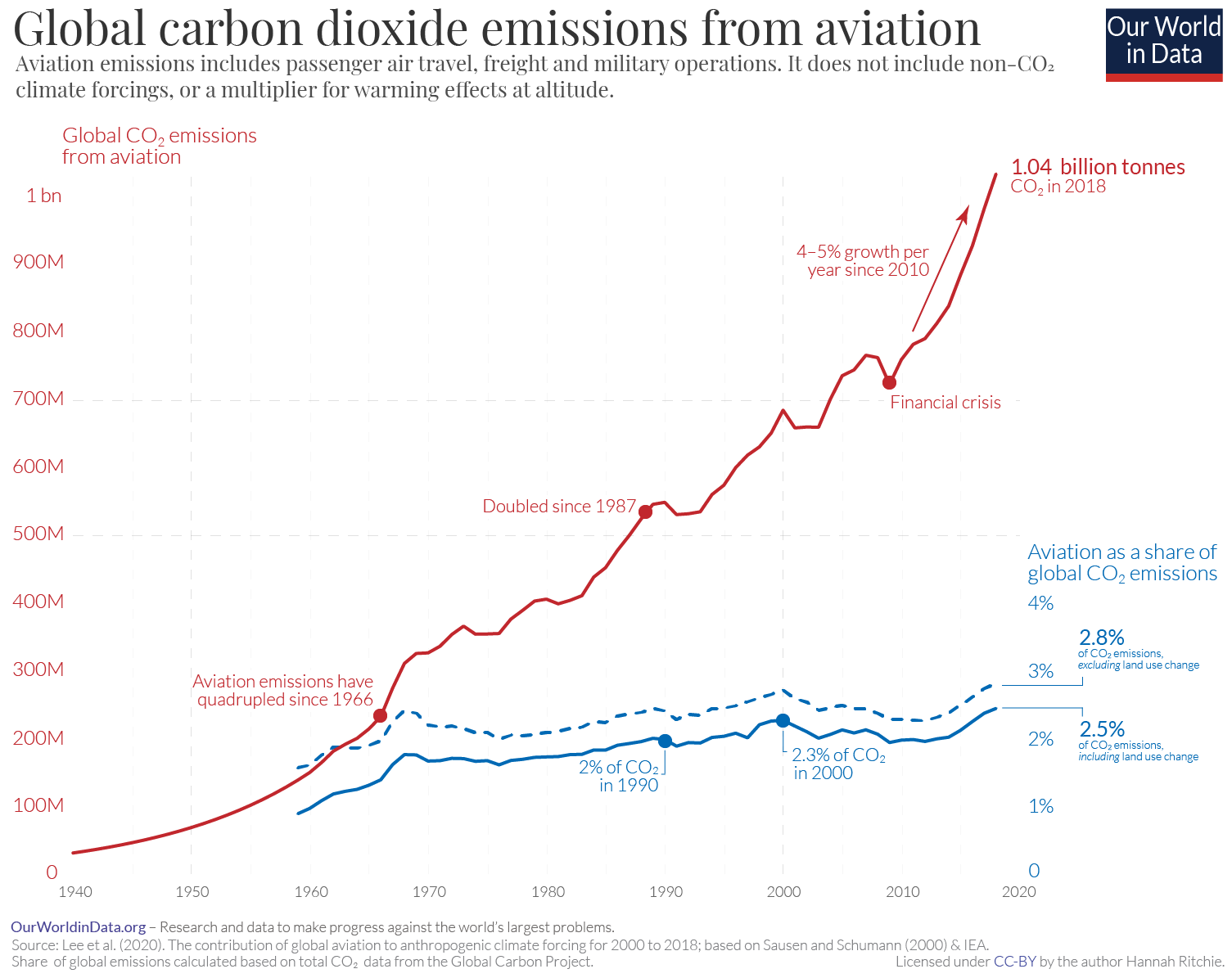
The Wealth of Nations: Max Roser’s World in Data (2013-Present)
Our next stop is ‘Our World in Data’, a compendium of interactive charts that tell the story of human progress. From life expectancy to literacy rates, from environmental degradation to the spread of democracy, Max Roser and his team distill complex datasets into visual narratives that put the state of our world into perspective.
-
Covid-19 Pandemic: Johns Hopkins University’s Coronavirus Dashboard (2020)
Our journey culminates in the present, amidst a global crisis. Johns Hopkins University’s real-time dashboard tracking the spread of Covid-19 has become a mainstay in the media and in our daily lives. It is a testament to the power of data visualization in shaping our collective response to an unprecedented challenge.
John’s Hopkins has stopped collecting data as of 3/10/2023 but you can see the historical content here.
As we traverse through time, these visualizations show us that data is more than numbers on a page. It is a medium of storytelling, a tool for change, a canvas for artistry. They speak to the power of data visualization to illuminate truths, inspire action, and help us make sense of a complex world.
At Tractorscope, we’re passionate about empowering developers to create their own visual narratives. Whether you’re a start-up seeking to understand user engagement, a healthcare company mapping patient outcomes, or a ticket selling software company analyzing sales trends, Tractorscope provides the tools to transform your data into insightful, engaging visuals. After all, who knows what stories your data could tell?
In the spirit of these ten chart-topping visualizations, we challenge you to make your mark on the canvas of data. Unleash your creativity, reveal your insights, and who knows? Perhaps your visualization could be the next one to change the world. 🩶
