Create chart
In the context of a bar chart, a "series" refers to a group or category of data that is displayed as a set of bars. Each series typically represents a distinct group or subset of data within the chart.
A bar chart can have multiple series, allowing you to compare and visualize different groups of data simultaneously. Each series is usually represented by a different color to differentiate them visually. The height or length of the bars within a series indicates the magnitude or value of the data being represented.
By organizing data into series, bar charts can effectively display and compare data across different categories, making it easier to identify patterns, trends, and variations within the dataset.
Applying a color theme to a series will make the chart more legible.
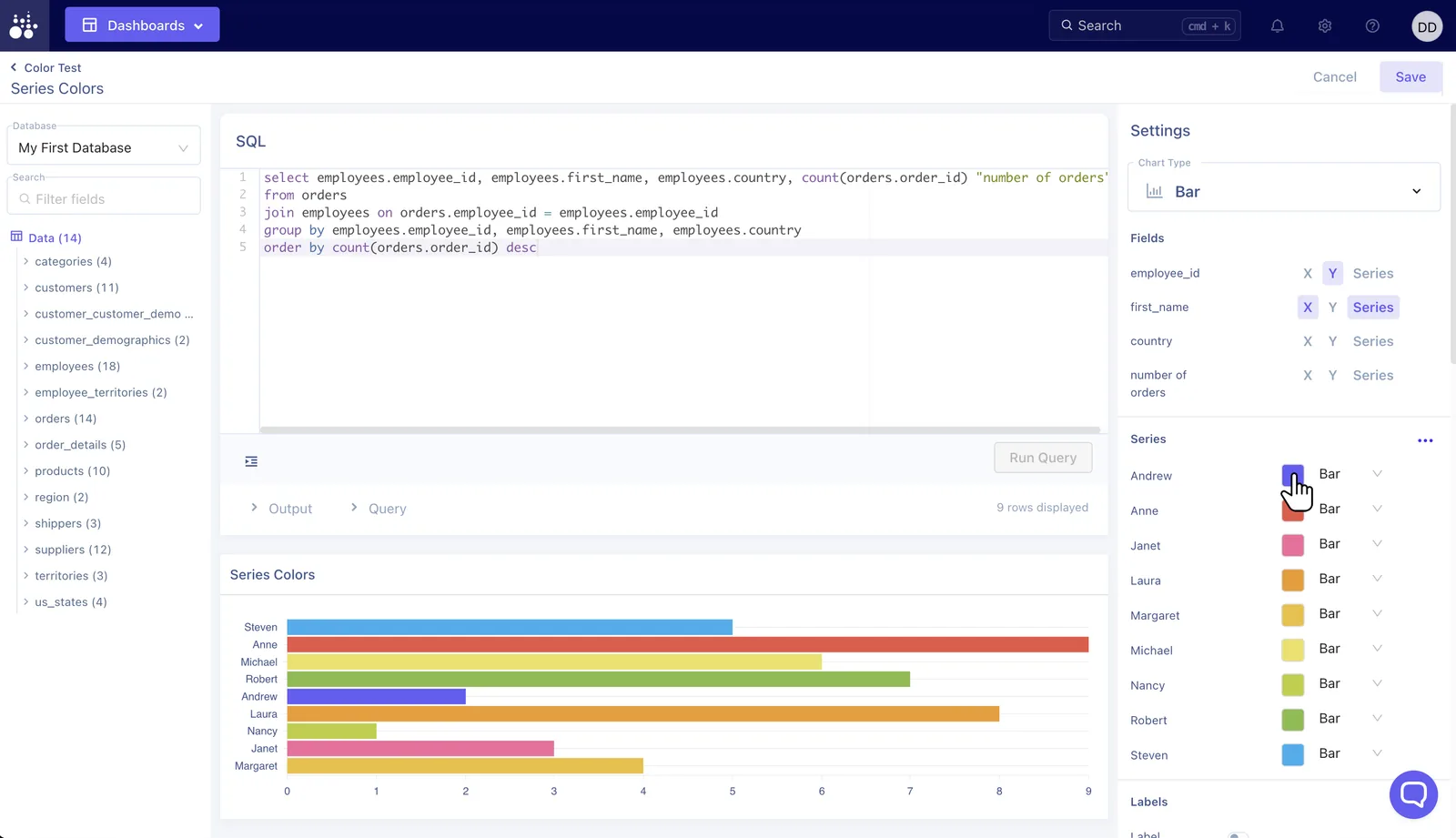
Choose which field should be grouped as the Series.
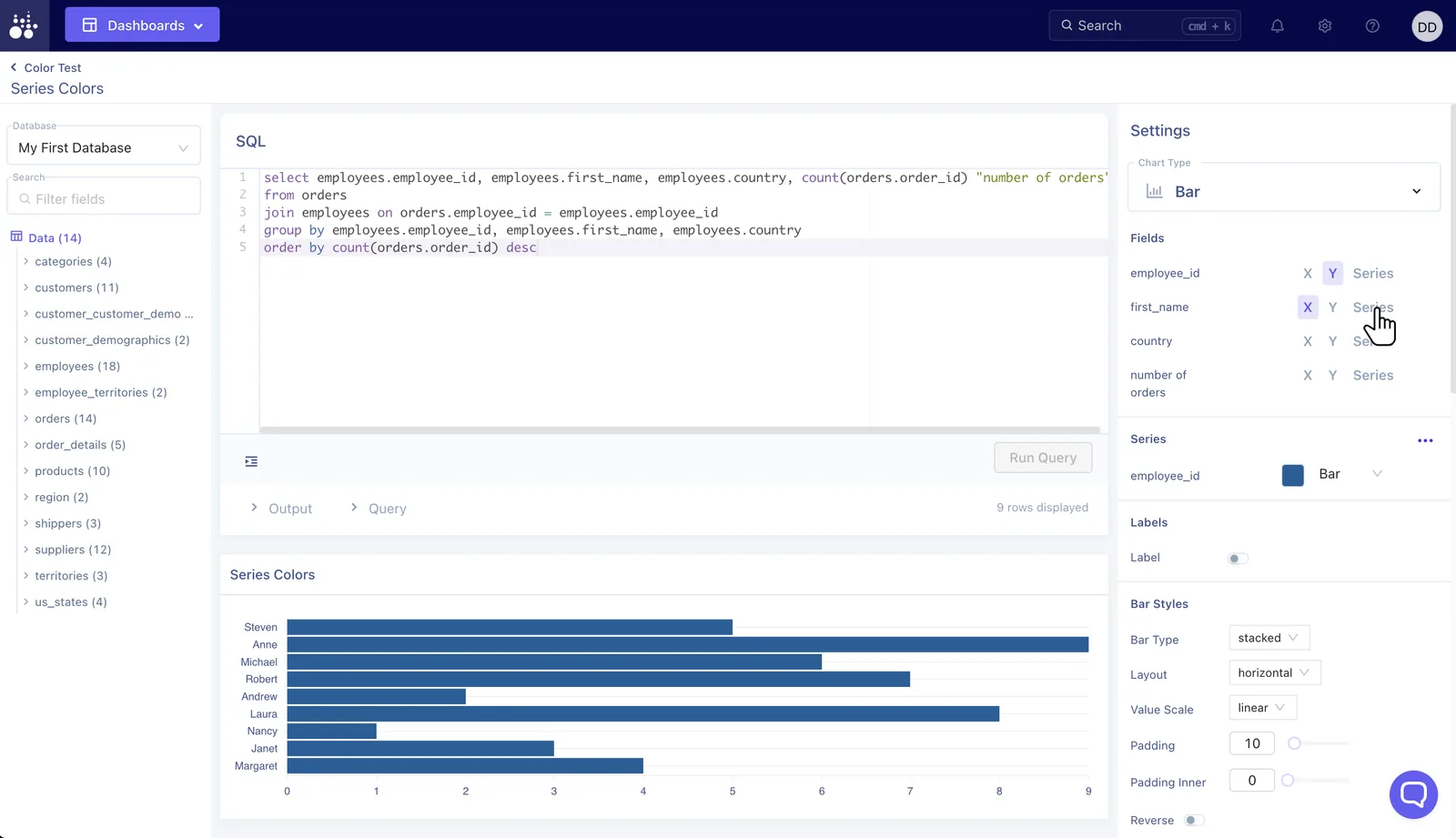
Choose Series
Selecting a Series will automatically apply a color theme.
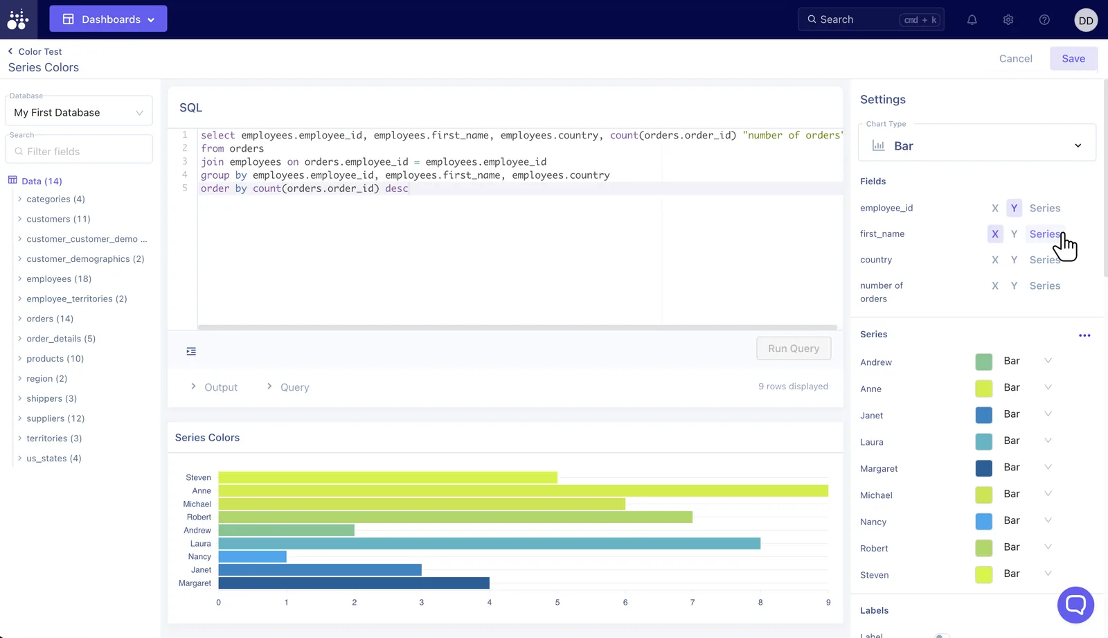
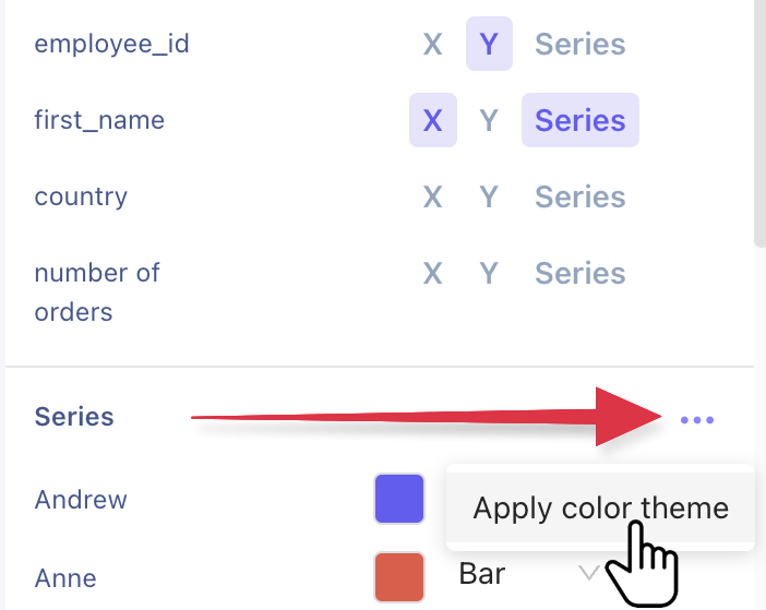
Apply color theme
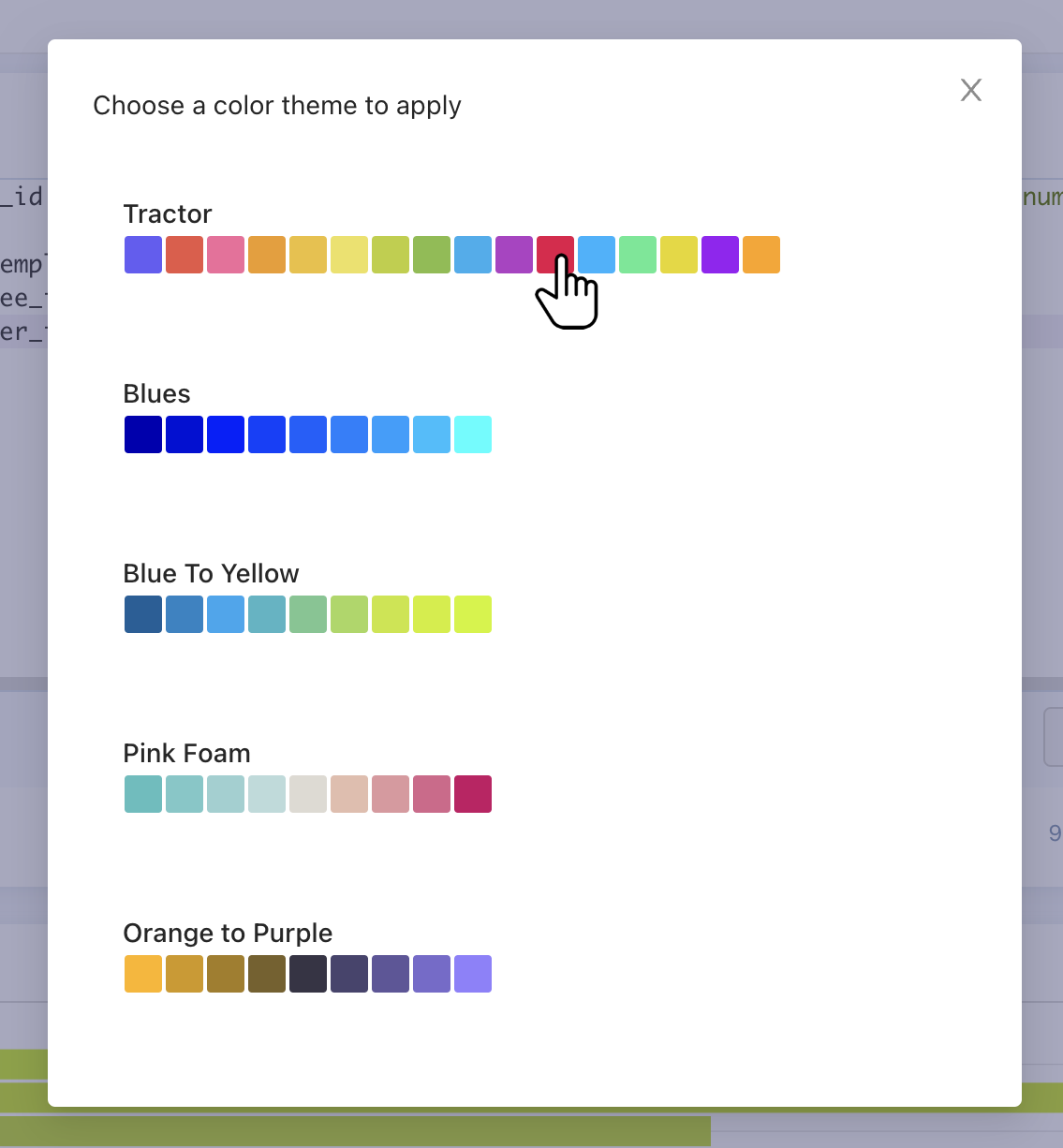
In the Series settings open the ellipsis menu and Apply color theme. This opens a modal with all available themes.
Choose theme
Select the theme you wish to apply and the modal closes as the Series auto updates with the selected colors.
Adjust if needed
Once the theme is applied, the colors can still be edited individually.
⚠️ If you change the theme again, the system will overwrite the manually edited colors with the new theme.